Why a Beautiful Space Image Is Not a Window
Learn how to read an astronomical image by checking its color, contrast, and framing, so you can see what the picture reveals and what it emphasizes.
A beautiful space image can make a nebula look close enough to touch, but its color, contrast, and crop are decisions—not a view through a celestial window. To read an astronomical image well, start by asking what kind of data it shows and how that data became the picture on your screen.
This does not make the image false. It means the picture is a visual explanation built from light, instruments, and choices. Follow those choices in order, and you can appreciate the image without confusing its appearance with what an unaided eye would see.
What kind of astronomical image are you looking at?
Before judging a picture’s color or drama, identify what it represents. A photograph made with visible-light filters, a composite that combines several filters, and a map of radio or infrared emission are different kinds of images. They may all show the same region of sky, but they do not record the same light.
Look for a caption or image credit that names the instrument, wavelength, or filters. Terms such as visible, infrared, ultraviolet, X-ray, and radio describe parts of the electromagnetic spectrum. Human eyes detect only a limited band of that spectrum, so images based on other wavelengths translate measurements into visual form.
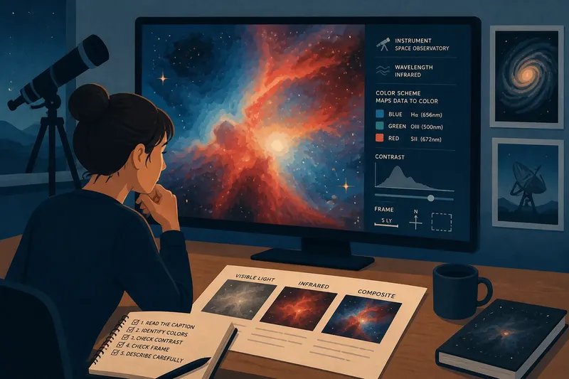
A caption might say that red, green, and blue channels correspond to separate filters. Those channel labels describe an assignment made for display; they do not necessarily mean the object emitted those colors as a person would perceive them. If the caption says “false color,” treat that as useful information, not a warning that the image is fabricated. It signals that color has been assigned to data for a purpose.
If the source gives no technical details, avoid guessing. You can still describe what the image visibly emphasizes, but distinguish that observation from a claim about the object’s natural color.
How do color choices change the message?
Color can distinguish data channels, highlight a feature, or make faint structure easier to notice. In a composite, each color may stand for a different filter or wavelength. The palette is therefore a key to reading the picture, not a decorative layer that can be ignored.
Check whether the caption includes a color key or explains the channel assignments. If blue represents one filter and red another, the image is showing a relationship between measurements through color. It is not necessarily offering a direct preview of what the object would look like to an eye, even with unusually good eyesight.
Some images use colors chosen to resemble visible-light appearance; others assign striking hues to data outside human vision. Neither choice is automatically more honest. A naturalistic palette can help readers imagine a familiar view, while a mapped palette can separate features that would otherwise blend together. The caption tells you which reading is appropriate.
Say you find a colorful image of a cloud of gas with no clear explanation. You notice bright blue edges and a red center, but the caption identifies only the instrument and not the color mapping. The responsible reading is that the display differentiates regions; without the mapping, you cannot infer that the blue edge is literally blue or that the center is physically red. Keep the visual observation and the physical interpretation in separate sentences.
What does contrast reveal—and conceal?
Contrast is the difference between light and dark areas in a picture. Raising contrast can make boundaries and fine structure stand out, especially where the recorded signal is faint. It can also hide subtle gradations by pushing dim areas toward black or bright areas toward white.
Look first at the darkest and brightest parts. Are faint surroundings still visible, or do they disappear into a flat background? Do bright features retain internal detail, or have they become a solid patch? These checks help you tell whether the image emphasizes a boundary, a luminous core, or the broader environment.
Brightness and contrast adjustments are common ways to make data legible. Their presence does not, by itself, mean that an image has been manipulated deceptively. The useful question is what the adjustment makes easier to see and what it makes harder to compare. A tightly stretched display may reveal faint filaments while making the difference between moderately bright regions less apparent.
When comparing two images of the same object, check whether they use similar processing and display ranges. One may look more detailed simply because its contrast has been set to emphasize dim structure. If the processing is not described, compare broad features cautiously rather than treating one image as a more complete portrait.
How does framing direct your eye?
A crop determines what enters the picture and what stays outside it. A close framing can make a small feature feel dominant; a wider view can show its setting and its relationship to nearby objects. Neither is inherently misleading, but each answers a different visual question.
Notice whether the image includes a scale bar, compass direction, or field-of-view note. A scale bar can help you judge the size of features within the depicted region, while a wider-field image can reveal how much surrounding sky has been omitted from a close-up. Do not infer an object’s real-world size from how large it appears on a screen.
Orientation also matters. An image may be rotated or flipped for layout, and the top of the frame need not correspond to the sky’s usual orientation. If direction is important to your interpretation, look for a north arrow or orientation note rather than assuming that “up” means north.
Framing can shape a story without changing the underlying data. A tight crop around a bright knot suggests focus on that feature; a frame that includes nearby structures invites comparison. Ask what you can see at the edges, then consider what the crop leaves you unable to judge.
How can you read an astronomical image in order?
Use a small sequence of checks before describing what a picture means. It keeps the image’s visual effect from outrunning the information supplied with it.
- Read the caption. Note the instrument, object, wavelength or filters, and any stated processing.
- Identify the color scheme. Find out whether colors correspond to visible light, separate filters, or wavelengths beyond human vision.
- Inspect the tonal range. Check for areas where faint detail vanishes or bright detail appears flattened.
- Check the frame. Look for a scale bar, orientation marker, and clues about how tightly the view is cropped.
- Separate observation from inference. Say what the picture visibly shows, then say what the caption supports about the data.
For example, imagine you are looking at a composite image of a spiral galaxy. The caption maps infrared data to red and visible-light filters to blue and green, while the frame includes a scale bar but no compass marker. You can say that the display emphasizes distinct structures in the mapped channels and that the galaxy is shown at a particular scale. You should not call its red regions naturally red or infer which direction is north from the frame alone.
What should you ask about an astronomical image?
Are space images real photographs?
Some are photographs assembled from recorded light, while others are visualizations or composites that combine data from different instruments or wavelengths. The caption should say what kind of image you are seeing and, when relevant, how its channels were assigned.
Why do space objects have colors the eye cannot see?
Images may translate infrared, ultraviolet, X-ray, or other measurements into visible colors so that different signals can be distinguished. Those colors describe a display choice, not necessarily the object’s appearance to human vision.
Does image processing mean the picture is fake?
No. Adjustments can make recorded details visible on a screen, whose display cannot show every difference in the original data. Processing matters because it affects emphasis, so look for a description of the choices rather than treating adjustment alone as evidence of deception.
Can two images of the same object look different?
Yes. Different instruments, filters, crops, color mappings, and contrast settings can bring out different parts of the same object. Check the captions before comparing the pictures as if they were made under identical conditions.
What does a beautiful image let you see?
A strong astronomical image can make a faint pattern legible, connect separate measurements in a clear visual form, or draw attention to a structure that would otherwise be easy to overlook. Its beauty is compatible with careful interpretation; indeed, knowing how the image was made can make the visual choices more interesting.
When you share or describe one, name its most striking visible feature and qualify what you cannot establish from the image alone. That habit keeps wonder intact while making room for the instrument, the processing, and the frame that helped produce it. The next time a nebula seems to glow in an impossible color, check the caption before deciding whether the surprise belongs to the sky or to the way the data were shown.